The Case
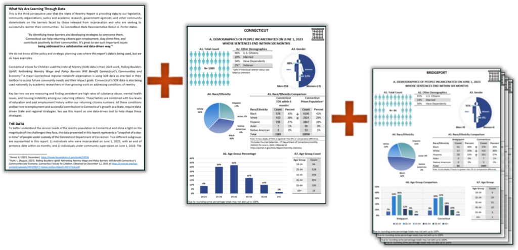
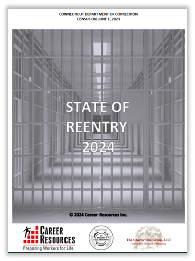
The client, Career Resources, Inc., publishes a yearly data report with a descriptive analysis of the reentry population in their state as a whole and within ten regions to help identify needs and address gaps in services for individuals returning home from incarceration.
The population is broken down into two subgroups and the data is a day-in-time census with information about each subgroup’s demographics, system involvement, and assessment scores (which are used for treatment and program planning in the correctional system).
For a nonprofit organization with a small team like theirs, such a detailed data report comes with challenges.
- Firstly, each data section (one statewide and ten regional) is comprehensive — containing 28 or more data visualizations.
- Additionally, the design and layout need to remain consistent throughout so everything reads as one cohesive report once compiled.
- Lastly, for the report to be timely and useful, it needs to be published by a certain deadline.
Solution Overview
My role in the team is to create the data visualizations and deliver a compiled report as a Word document and as a PDF using the clients layout and design specifications.
I have broken down the project into three phases (Data Preparation, Creating the Visualizations, and Creating the Report) and used different features:
- Power Query helps streamline the preparation phase.
- Excel formulas containing named ranges are used to pull data dynamically and then referenced in the visualizations.
- For the report, Microsoft 365’s object pasting feature makes it possible to link Excel visualizations to Word templates.
The sections that follow provide details and visuals on how each phase was streamlined.
Preparing the Data
Two different groups are represented in the report, so the client provides two tables, each in a separate Excel file. I consider the process in this phase as a mini-ETL (extract-transform-load) process.

Duplicates of the tables get brought into an Excel workbook that is just for preparing the data. Some preliminary cleaning is done. The tables are then loaded into Power Query, where the rest of the cleaning and transformation has been automated. At the end, the tables are appended to a dataset containing data from previous years.
Creating the Data Visualizations
The data visualization process happens in a separate Excel workbook. One sheet (Data Import) contains the prepared dataset from Power Query. With the data in tabular form within one large dataset, it is easier to search for specific information.

In a second sheet (Data Analysis), data for different census categories are filtered into cell ranges based on the region and year. The formulas are made dynamic by using the Filter() function and two named cells — “Region” and “censusYear”. When the named cells’ values are changed, all the cells update. Since there are two subgroups, there is a set of ranges for each.
Each set is referenced in a corresponding data visualization sheet, so the data visualizations update automatically whenever the Data Analysis sheet updates.
Creating the Report
The three main sections of the report are the analysis, the statewide data, and the regional data. The components are prepared in separate Word documents which have been formatted to have the same layout and design.
The first document (the Report template) contains the introductory pages, the descriptive analysis and two blank pages as placeholders for the data visualization sections. In the Statewide and Regional templates, most of the data visualizations have been added as linked objects from the Visualizations Excel file. Updating the templates each year mainly involves selecting and refreshing the objects.


To create data visualizations for each region, the filter in the Visualizations Excel file is used to select the regions one-by-one, and a copy of the Regional template is saved each time. Once the three sections have been made, they get combined into one Word document, the Table of Contents is updated and a PDF is created.
By having several steps in each phase automated, accuracy has improved. As a result, the project takes less time to complete not only because the visualizations and the compilation are done quicker but also because less revisions are needed.


